By: Lexi Applebach
We’ve all been there. It is 11:30 PM, you have 42 tabs open, and you are completely convinced that if you just find the exact right hex code for “sage green,” your entire wedding vision will flawlessly fall into place.
Building a digital color palette gives you a massive dopamine hit. It feels like you’ve finally cracked the code to that high-end, Vogue-style aesthetic. But I have to be the one to tell you the truth: your mood board is just the warm-up. The actual day requires translating those perfect little digital squares into physical flowers, linens, and stationery.
Bridging the gap between a backlit screen and a physical room takes a bit of behind-the-scenes grit. Here is the reality of what happens when your digital palette meets the physical world.
1. Mother Nature Does Not Care About Pantone
When you hand a digital swatch of “sage” to a florist, you have to remember that you are dealing with a live product. Mother Nature does not manufacture flowers to match a hex code.
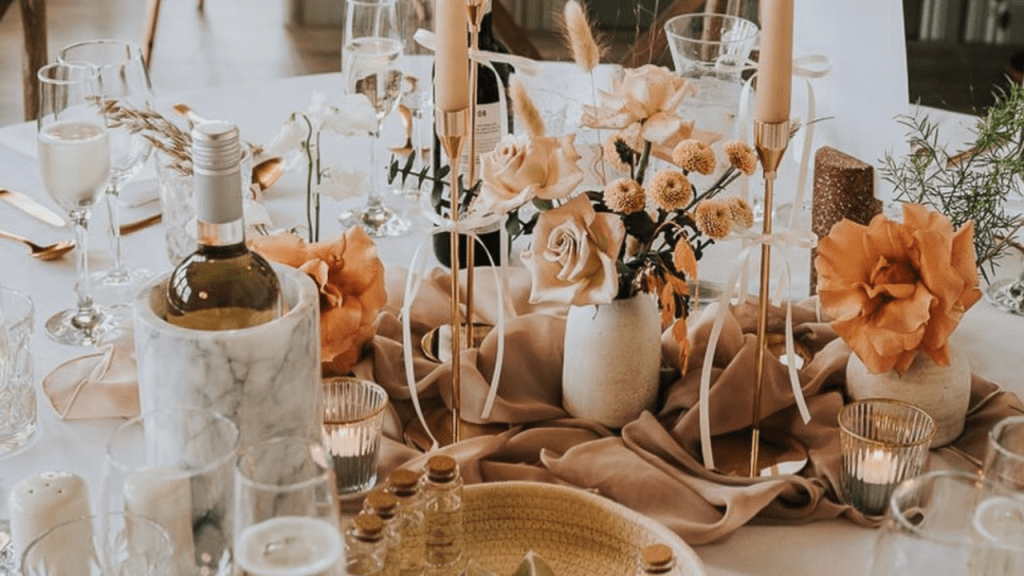
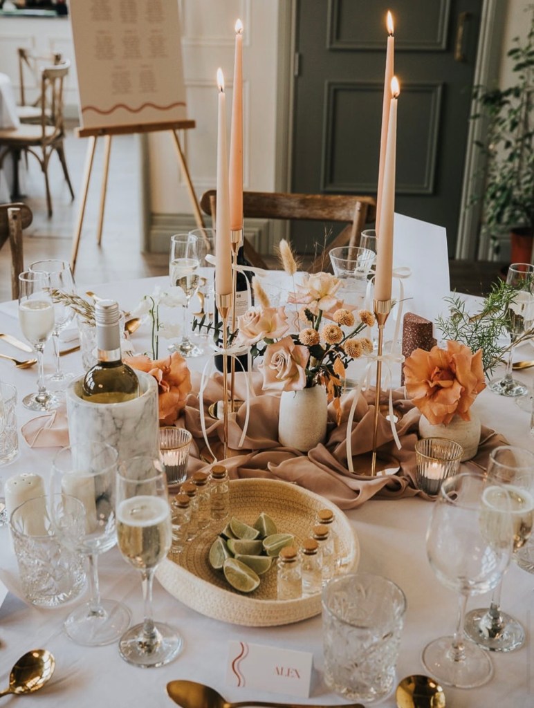
If you want that soft, muted green, your florist will likely source eucalyptus, dusty miller, or olive branches. But here is the catch: the shade of those greens’ changes based on the season, the rainfall, and the farm they were grown on. If you expect a 100% precise color match on your centerpieces, you are setting yourself up for heartbreak. Instead of demanding an exact shade, give your floral team an “anchor vibe.” Trust the professionals, like @romi_bloomflorals, to focus on the overall texture and movement of the arrangements rather than a rigid color match.
2. The Venue’s Lighting Will Change Everything
You can buy the most perfect cream-colored napkins in the world, but the moment you place them inside your venue, the color will shift.
In my recent blog on Newcastle’s top venues, I talked about the specific mechanics of different spaces. If you are hosting your reception in a blank-canvas industrial space like Tyne Bank Brewery, the ambient lighting might pull warm and amber, making your crisp cream linens look slightly golden. If you are in a light-filled heritage building like The Exchange 1856 on an overcast, rainy UK afternoon, the natural light will pull cool, making those same linens look almost grey.
When you do your venue walkthrough, take physical fabric swatches with you. Look at them under the room’s actual lighting, not just the ring light in your living room.
3. Texture is a Color
This is the secret weapon of high-end editorial design: texture completely alters how our eyes perceive color.
A flat, standard-printed “sage green” menu card is going to look completely different than a sage green velvet table runner. When you are building out the excel sheet for the budget, factor in the cost of texture. If your color palette feels a bit “flat” when you try to recreate it in real life, it usually isn’t the color that’s wrong, it’s the material. Upgrading to a slightly thicker cardstock with a deckled edge or swapping a standard poly-blend tablecloth for a textured linen, instantly elevates the visual weight of the color.
Takeaway
Your mood board is a brilliant starting point, but do not let it become a trap. A truly unforgettable, visually stunning wedding day happens when you stop stressing over perfectly matching your bridesmaids’ dresses to the dinner napkins, and start focusing on how the whole room feels together.
Give your vendor team the grace to interpret your palette, and focus your energy back where it belongs: on the romance.
What is the primary color in your wedding palette, and what is the hardest thing you’ve had to color-match so far? Drop your anchor colors in the comments below so we can tackle the design logistics together and be sure to follow me on Instagram @lexiapplebach to see how I’m navigating these behind-the-scenes details in real-time!

Leave a comment